
Use the visual organizing principle to design an authentic identity
Years ago, design legend Saul Bass famously said, “logos are a graphic extension of the internal realities of a company.” Here at New Kind, we couldn’t agree more.
Of course, in his time, logos were king. These days, it might be more accurate to say, “a brand is an extension of the internal realities of a company.” So what does that mean?
An organization’s brand encompasses all kinds of things. Its logo. Its story. Its website, social presence, video content—all the ways you behave online and off. You get the idea. In 2018 there are so many ways to interact with a brand that they all become extensions.
And they have to speak in unison.
Especially when it comes to your visual brand, which for many people is often the introduction to who you are. It’s the hook.
The most successful visual brands are rooted in an authentic story and culture—an outward expression of who you truly are and what you really care about. If your brand is made up of disparate expressions, each saying something different, the result is confusing at best, inauthentic at worst. Your audience will see right through it.
At New Kind, we’ve developed a tool that has been instrumental in helping us deliver authentic visual identities for clients time and time again.
We call it the Visual Organizing Principle.
This is an internal dynamic concept—a short, simple articulation of a key overarching idea from a brand’s story. This inspirational word or phrase guides the development of every aspect of a brand’s visual identity. It’s the statement we constantly check our work against to ensure our creative choices align to the core of the brand. Remember, though, that the Visual Organizing Principle is an internal concept, not intended for outside consumption.
We know. This sounds like a no-brainer. Of course a brand’s visual identity is related to the overarching story. But it goes deeper than that. What makes the Visual Organizing Principle such a powerful tool is that it emerges from a thorough, strategic understanding of a brand.
Only after conducting research (surveys, interviews, and audits of existing marketing materials), developing positioning (competitive frames of reference, points of difference, points of parity), and crafting story and messaging (narrative in a succinct, poetic, and memorable way), can we know your brand well enough to create a compelling and authentic visual identity.
3 Qualities of an effective Visual Organizing Principle
An effective Visual Organizing Principle must:
1. Answer the question: why does the organization exist?
Your goal is to capture, at the highest level, the foundational purpose and mission of the organization. In a world that’s constantly changing, what about your organization has always been true?
2. Be vivid
Try to paint a picture in the mind’s eye. Choose words that have a visual quality to them: Not just inspired, but driven. Not just safe, but steady. The thesaurus is your friend.
3. Tell a story
Ensure your Visual Organizing Principle connects back to your organization's story. Use similar language and tone, we want the words to feel like a natural outgrowth of the story you want to tell the world.
The principle in practice
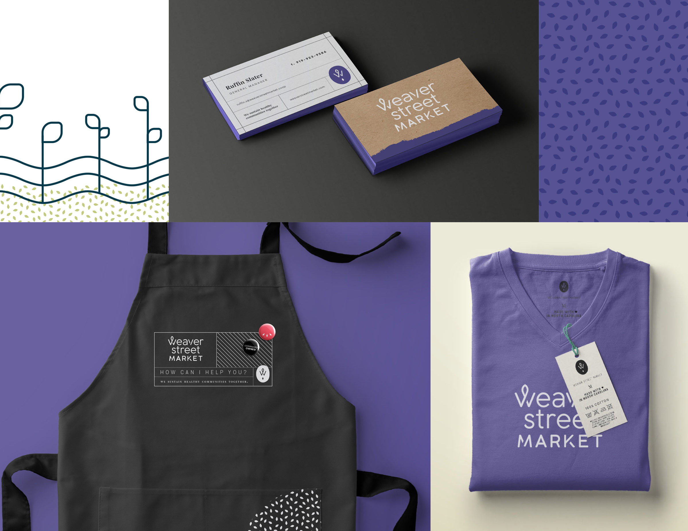
Weaver Street Market
When developing a new brand and visual system for Weaver Street Market, a community-owned grocery store in Carrboro, NC, we needed a visual organizing principle that encapsulated the heart and soul of what they do. It may seem strange to think about a grocery store this way, but as we got to know the Weaver family and community, we realized they’re much more than a grocery store.
You can buy your asparagus and seltzer water anywhere. Only at Weaver Street — with its co-operative business model, its open community spaces, its fresh, prepared-in-house foods, its commitment to supporting local producers — will you always walk away with something more. It’s about the goods they sell and the good they do. And it was up to us to tell that story visually.

So we asked ourselves: What sets Weaver Street Market apart? The Visual Organizing Principle became Nourish. Weaver doesn’t just feed people. The spirit of nourishment brings to mind ideas and imagery centered around healthy, sustainable growth—for food, for communities—which is core to the Weaver Street story and identity. This idea inspired every piece of the visual system, from the logo and palette to the patterns and photos.
Red Hat Developer Program
For one of our more recent identity projects, we rebranded the Red Hat Developer Program. In addition to articulating their story and helping them develop a solid messaging architecture, we redesigned their entire visual system and worked closely with the Red Hat UX and design teams to give their website a full makeover.
The Developer Program serves as Red Hat’s link to the developer community, uniting this vital audience around shared knowledge and tools, empowering them on their lifelong journey. It’s a powerful story — fundamentally tied to Red Hat’s origins and core identity — so we knew our Visual Organizing Principle had a lot of work to do.
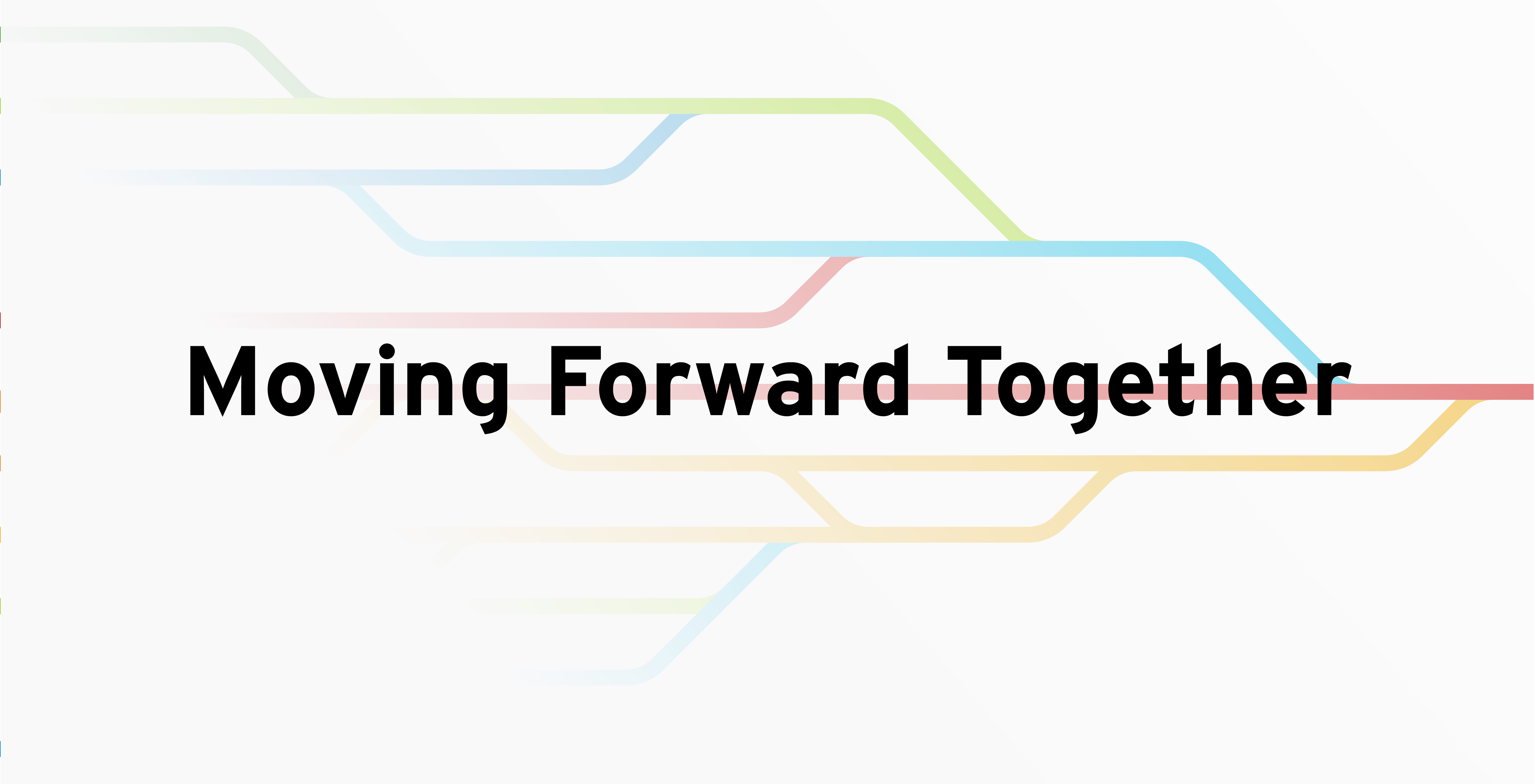
In this case, the Visual Organizing Principle became an internal rallying cry central to the Developer Program’s story and messaging: Moving Forward Together. These three words describe the overarching feeling we wanted the Developer Program to invoke and embody.
The logo is an abstracted simplification of the universal code block. It expresses the story through its parallel paths and sense of forward motion. They represent the lines of code that developers use every day, but also the collaborative journey that a larger community of developers share.
Parting thoughts
Tools like the Visual Organizing Principle help simplify the process of creating a cohesive brand identity—allowing you and your organization to seamlessly align how you look (your visual brand) with how you sound (the story you tell).
Why should you care? A cohesive brand experience makes it easier for your core audiences to connect with you, building trust and solidifying your reputation. And when you have a strong reputation among the people who buy from you, they'll return time and again.