Simplify tech product naming by building a brand architecture diagram
Let’s face it. Naming new technology products can be a painful experience. If you’ve spent time leading a technology marketing team, you are probably familiar with at least one of the following naming scenarios:
- The lead engineer of the team building the product comes to you with a name his team is head over heels in love with, but it doesn’t work for the business. “Guess what? We came up with the perfect name yesterday! [name that makes you shudder uncontrollably]. Awesome, right?”
- Every new product your company develops chooses a totally unrelated name, individually picked by whomever is leading the project, and your product portfolio now looks like a drawer of mismatched socks.
- Your creative team or agency lovingly produces a set of 15 beautifully-articulated, poetically-rendered name choices, only to watch in horror as they are mercilessly slaughtered in turn by the product manager for seemingly arbitrary reasons. “This one sounds like a generic laundry detergent. This one doesn’t feel enterprise-enough. This one reminds me of the guy who stole my lunch money in school…”
You can avoid product naming problems like these by adding a little more structure to the process. Which is why we love beginning every new product naming project by creating or revising a company brand architecture diagram.
What is a brand architecture diagram?
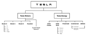
A brand architecture diagram is a simple, clear visual schematic that shows every brand in the company portfolio and articulates how each relates to the others. For an example of what this looks like, I spent a few minutes on the Tesla website and mocked up what the company’s brand architecture diagram might have looked like in August 2017 when I wrote this.
More on Tesla in a bit.
There are several key benefits of having a current brand architecture diagram when beginning a product naming project.
First, it ensures that everyone staked in the new product name has a wider strategic view of all of the company brands and how they fit together. This helps ensure the final name does double duty, both as a good fit for the product itself, but also reinforcing a cohesive naming strategy for the company as a whole.
Second, reviewing potential new product name options in the context of a brand architecture diagram focuses energy on the functional strength of the name. Companies with a strong corporate brand like Tesla should feel less pressure to develop unique names for each and every product because these sub-brands gain strength from their association with the master brand.
Finally, a brand architecture diagram makes it easy to build and analyze future naming scenarios, comparing the current architecture to suggested future changes to visualize which option would work best and what ramifications it might have beyond the new product itself.
Let’s look at an example of how you could use a brand architecture diagram to make a more educated naming decision.
Example: The Tesla Truck
Deep within the walls of Tesla, Inc., there is a super-secret effort to develop a new electric pickup truck (I’m making that up, but just imagine for a minute that it is true).
Many members of the internal team have strong feelings about the name of the truck, which has been codenamed the “F-Bomb” (Ford F-150 is the most popular truck, and this is the weapon to finally take it out). Some have even half-seriously suggested that Tesla F-Bomb could be the actual truck name. Elon thinks that idea sucks.
But the product marketing team already has a clear naming architecture for new vehicle names. New vehicles since the Tesla Roadster (which is no longer on the market), all use a simple descriptive naming strategy
Model [blank]
which keeps the brand energy focused on enhancing the strength of the Tesla brand rather than on the vehicle name (often a great strategy, by the way).
The three main vehicle models were originally intended to be called Models S, E, and X. Yes that spells what you think it spells, and it was not an accident, as you can read about in this story from Fast Company. Long story short, when it came to the new Model E, Ford threatened to sue because they had applied earlier for a trademark on that name. So Tesla decided to flip the letter around and name their new sedan the Model 3 instead.
So because of that existing structure, the team has narrowed things down to three final descriptive name choices for the new truck:
- Tesla Model Y
- Tesla Model 4
- Tesla Truck
(Model T was the obvious choice, but Ford had a pretty clear claim on that one too.)
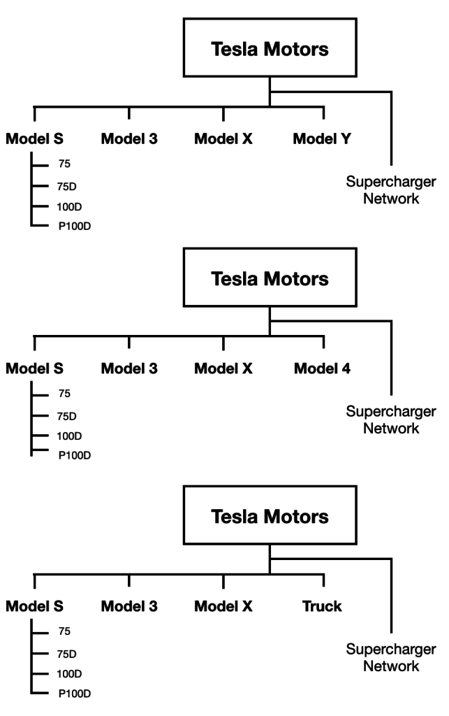
Next, they plugged each name option into the brand architecture diagram to see how they looked in the context of the rest of company brands (and went ahead and killed off the Roadster at the same time). Just focusing on the Tesla Motors part of the diagram:

This makes it super easy to look at the pros and cons of each name, both on its own and in the context of the overall descriptive naming architecture.
- Model Y is a fun name that fits within the architecture because it builds on the original S-E-X conceit, turning it into S-3-X-Y. But the letter Y doesn’t really say much about a truck, so that would be meaning that would have to build over time.
- Model 4 makes a nice transition from the most recent product, the Model 3. People get sequential numbering, it’s easy to understand. But again, the downside might be that the number 4 doesn’t really scream “truck.”
- Calling it the “Tesla Truck” is definitely the most straightforward, albeit not particularly imaginative, name. It calls a duck a duck, and has some nice alliteration. But it also breaks the new naming formula. And what would Tesla do if they decided later to develop a line of commercial trucks as well?
Looking at these three names in the context of the overall brand architecture helps the team eliminate “Tesla Truck” as the name pretty quickly, as it breaks the naming convention and hurts the simplicity of the brand architecture. So it comes down to “Model 4” and “Model Y.”
And the final decision? To call the truck Model 4, and begin the transition from letter based vehicle names to number-based (since, after all, what were they going to do after Y anyway?).
A few tips on building your own brand architecture diagram
Here are a few tips as you begin creating a brand architecture diagram for your company:
- Start with a diagram that shows the “current state” and share that around. Get people to add things you may have missed, debate whether brand names are in the right place, etc. Encourage people to mark up your version and edit it until they think it is right. You’ll want to have broad agreement on what the current brand architecture looks like (which is often harder than it sounds) before you start deciding on how to add new things to it.
- Consider creating two versions of the diagram, with the first as a simple version that only includes company brand, product brands, division brands, etc. Use this version to share around the company in most cases. But also create a more detailed version that includes not just product-level names, but also named branded features, services, etc. This will help you evaluate whether naming is unevenly handled in different parts of the organization, or whether it is out of control completely and needs to be reined in.
- Once you have a solid draft, compare the brand architecture diagram to the product section of your website. This may help you uncover some ways to simplify the organization of the content, make it even easier for your customers to understand what your products do and how they fit together.
- Remember to go back at least once a year and update your brand architecture diagram, then share it around to ensure it is always up to date when a new naming conversation comes up.
