New Balance Breaks the Mold for Promoting their New 3D-Printed Midsole Sneakers
3D Printing has taken off in a way that I think a lot us did not expect. It wasn’t that long ago that it was a futuristic novelty. Now it’s completely changing the way products in just about every industry are produced and the way companies market. Yesterday, New Balance posted a fantastically creative image, and I couldn’t help but gush over it for almost 500 words.
#3D
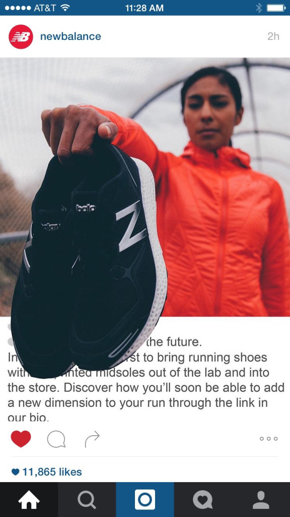
New Balance went full on meta for an Instagram post to tease their 3D-printed midsoles. At face value, it’s undeniably rad. But let’s delve into a bit of analysis as to why this image works so well. I’ll meet you below the photo.

Oh, hey there! Nice to see you again. Let’s dive in. Why is this image so cool?
Depth of Field
Let’s start with the image itself, prior to post processing. An image of someone holding a pair of shoes would be fine, but because the image has a very sharp depth of field, it forces your eyes towards the shoes. Even though the shoes compose a minority of overall screen real estate, they dominate the photo because they, along with the person’s hand, are the only objects in focus.
Challenging Preconceptions
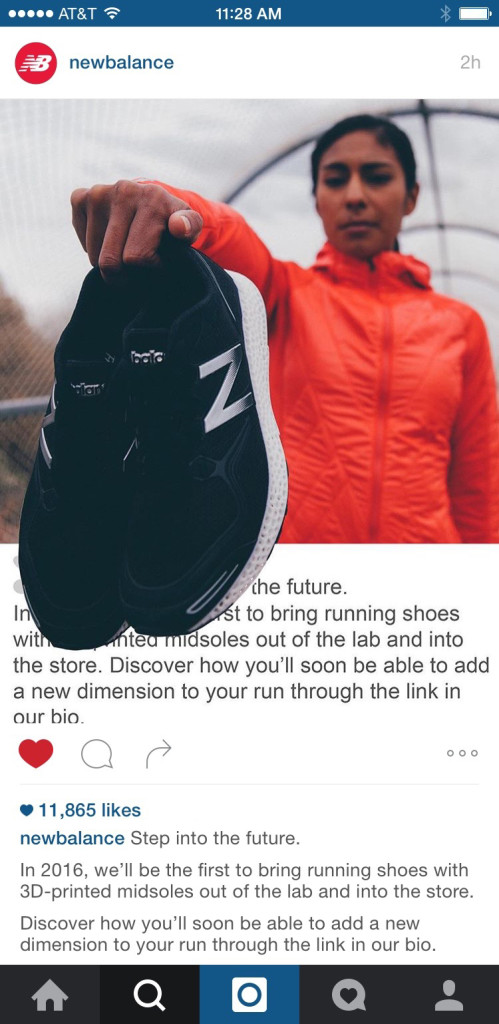
If you’re an avid Instagram user, you have a general idea of how images are “supposed” to look. There’s a picture, then there’s a white block below it with a heart icon, comment icon, and share icon, then the number likes, then the caption, then the comments. The marketing team at New Balance knew this and exactly how to blow your mind while scrolling through your feed. By including a fake caption within the posted image, they designed it to make it look they were defying the laws of Instaphysics. That way, when you saw it, your first thought was, “Wait…what? How did they do that?” Mission accomplished.
Below you can see the “full image” where the faux caption is contained within the image.

Taking Advantage of New Updates to the Medium
This type of Instagram post wouldn’t have been possible even just six months ago. Because Instagram now allows you to post portrait images, that gives a lot more space to play with.
Look at the images below. These were the images Instagram provided during their announcement to show the different in images size. You can see how the portrait is just about the same space as a classic Instagram image + the likes, caption, and comment section. The dimensions lend themselves perfectly to creating a dummy comment section.
– – –
I love watching brands constantly pushing the limits of social media. Hats off to New Balance. Or would it be shoes off… or shoes on… I’ll stop before I get lost in my own metaphor and just say, well done!
