
A Frank Observation: We Review an Exclusive Typeface from Digital Typefoundry Milieu Grotesque
One Friday morning recently, I walked into the office and, on my way to pouring my first coffee of the day, stopped by Matt Muñoz’ desk as he opened a package. He had received an email from Milieu Grotesque, the digital type foundry that created the Maison Neue typeface of which we’re particularly fond. They were inquiring to see if we would be interested in an exclusive typeface limited to only 100 licenses. It immediately grabbed Matt's attention:
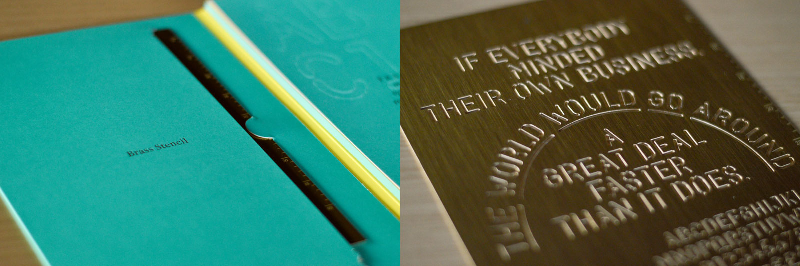
“Stencils are always pretty sweet, which is what first caught our eye about Frank. Not to mention it came with a physical brass stencil! Frank reminded us of the old lettering templates we used to use. — We’re big fans of Milieu Grotesque—the type foundry who also crafted Maison Neue—the core typeface in New Kind’s upcoming brand language. We thought this new typeface would be fun to experiment with for future projects.”
He pounced on the opportunity and two weeks later unwrapped the package and handed me a white and oddly heavy book; the cover inscribed, “FRANK – Brass Stencil & Specimen.” And voilà! My first contact with one Milieu Grotesque’s newest offerings: Frank.
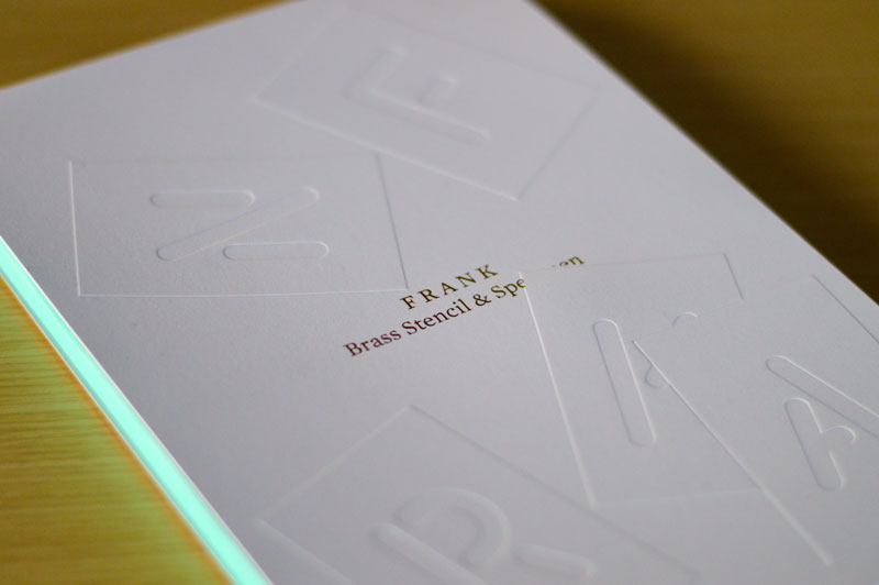
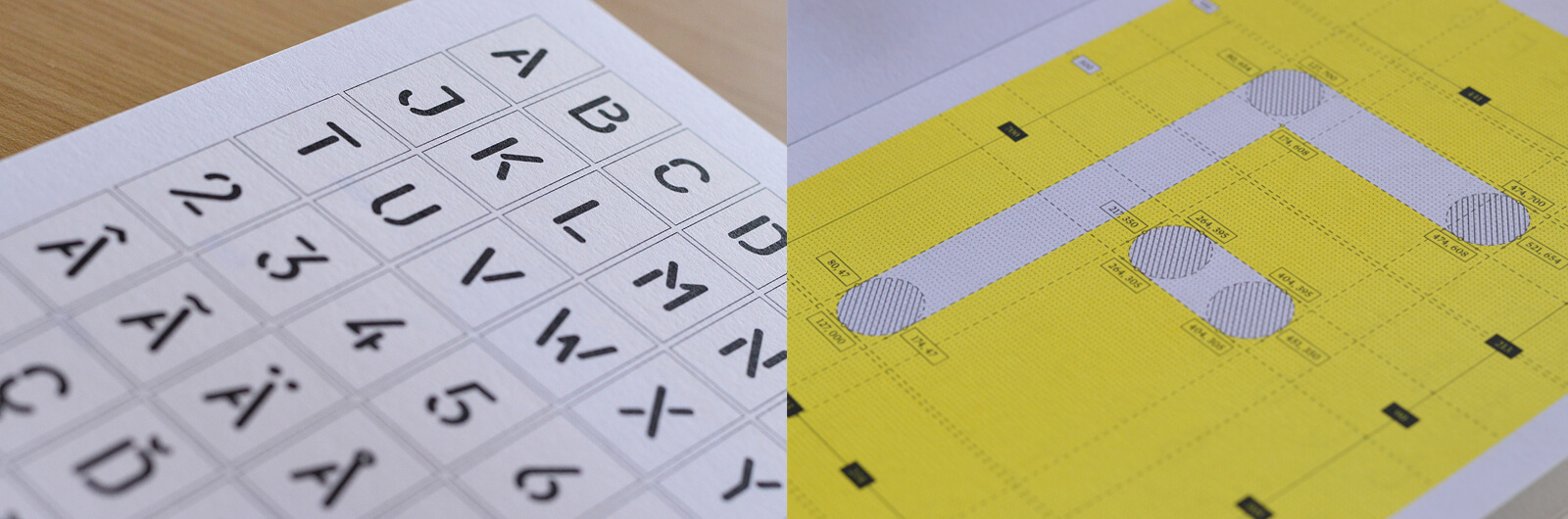
The specimen itself is an experience, to say the least. It’s any designer or creative thinker's aqua, yellow, black, and gold dream come true. Flipping through its pages yields a healthy balance of necessary details, enriching background information, and whimsical, Alice in Wonderland-themed compositions displaying Frank at its finest. The accompanying brass stencil is the proverbial icing on the cake, allowing one to grasp the typeface in what could be argued as its native form.
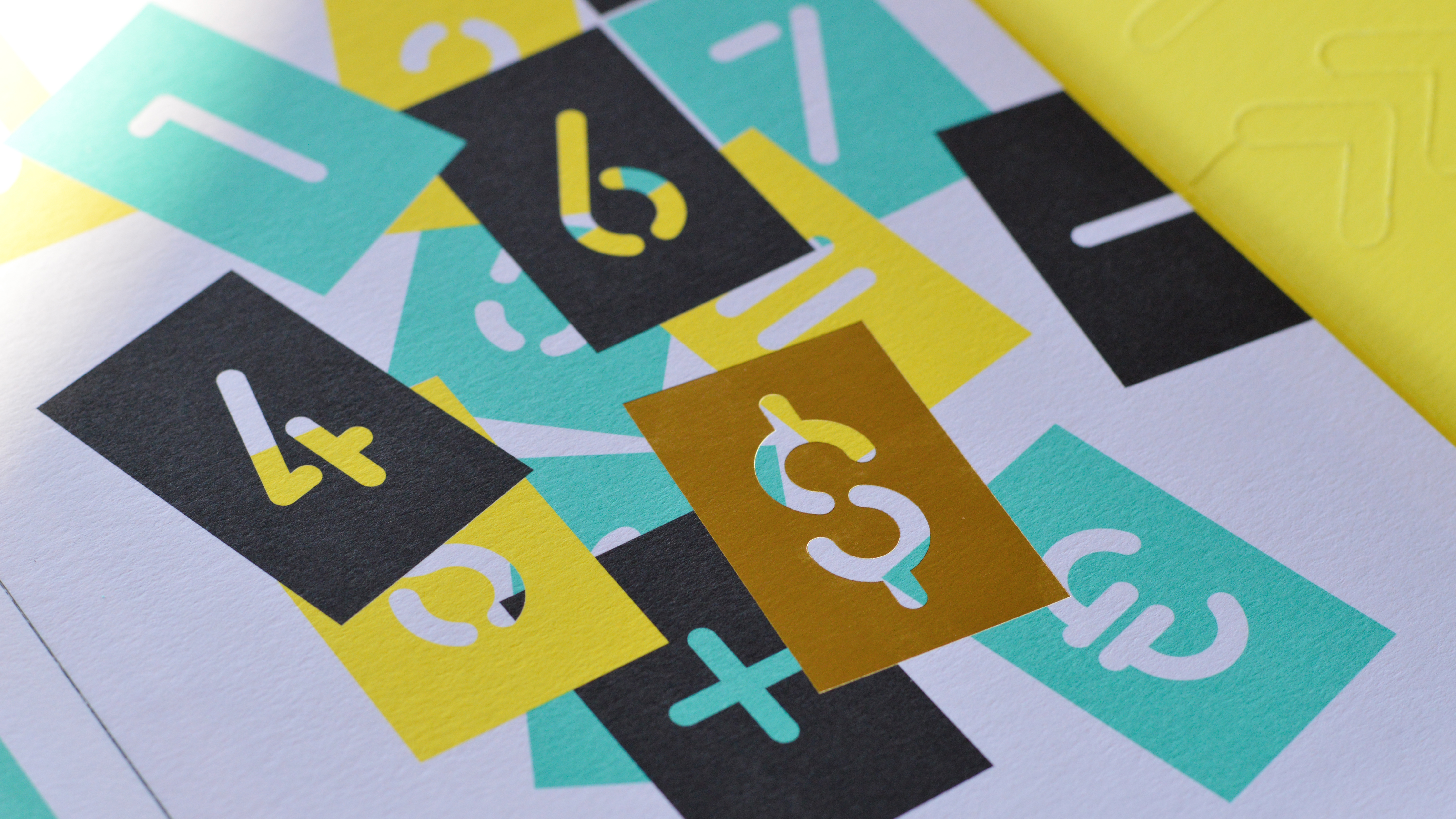
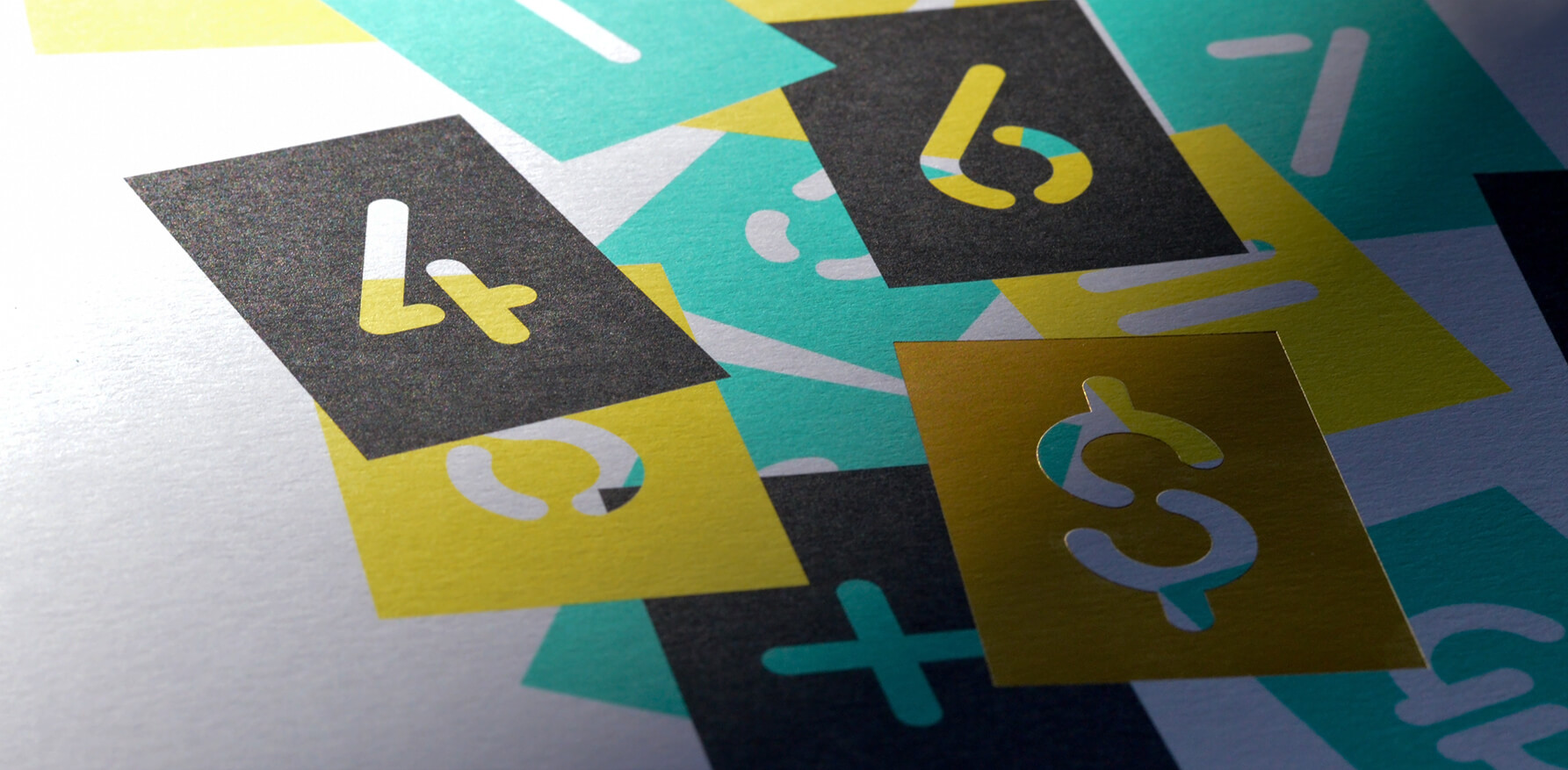
Officially, Frank is a rounded, modern stencil face. But its potential transcends what I would initially deem for a stencil face, moving beyond less-refined contexts and into a new realm of tasteful attitude. Frank is equal parts gritty and innocent; no-nonsense and eccentric. He is brash and unapologetic, but not rude. He's the bad boy that you can bring home to meet Mom and Dad.
Each character’s geometric, mono-linear qualities create a smooth stability that concludes with approachable rounded ends, manifesting in words that dominate the canvas with what I'm going to call “buttery aggression.” This typeface is a display face in every sense of the word—wholeheartedly refusing to play second fiddle, it is perfectly at home in sizes upwards of 80 points. Frank can certainly play nice with a variety of supporting faces, as long as they refrain from (futile) attempts to overtake it.
Frank is poised to play an interesting role here at New Kind: we designers are eager to find its full potential as part of our repertoire. And we're excited to discover more ways to utilize and showcase the fine work that the foundry continues to produce.