Modernizing the learning landscape
LIRN and New Kind revitalize an education leader's identity for ongoing innovation
Background
Since its founding in 1997, the Library Information and Resources Network (LIRN) has been on a mission to empower private education institutions. LIRN gives private, often highly specialized schools access to the same library and learning resources given to public colleges and universities. All to help students thrive in their academic careers and beyond.
What started as a small consortium of private schools has grown into a global operation. LIRN now serves almost 300 schools in 43 states, 4 territories, and 7 nations. And they’re not done yet.
LIRN approached New Kind to help fully revitalize their brand. To tell the story of their impact in the lives of librarians, educators, and students around the world—and to create a visual system reflective of the forward-looking, transformative organization they are.
Industries: Technology
Services: Identity System, Research, Storytelling
Why New Kind?
“Branding can be a very intimidating process, but New Kind helped us to discover the essence of who LIRN is by guiding us through the journey from start to finish . . . Each step of the way, we were led by skilled professionals who had walked this path many times before. This enabled us to focus less on the process and more on getting the message right. The collaborative nature of the branding exercises meant that when complete, our new brand feels natural to us, because it IS us.”
Andrew Anderson
President and CEO
Research
Learning how today’s students learn
Our process began with a deep-dive into LIRN’s existing brand materials and competitive research to better understand the challenges and needs of their member customers—private higher education institutions. Additionally, we conducted an audit of the competitive landscape and current state of LIRN’s digital presence.
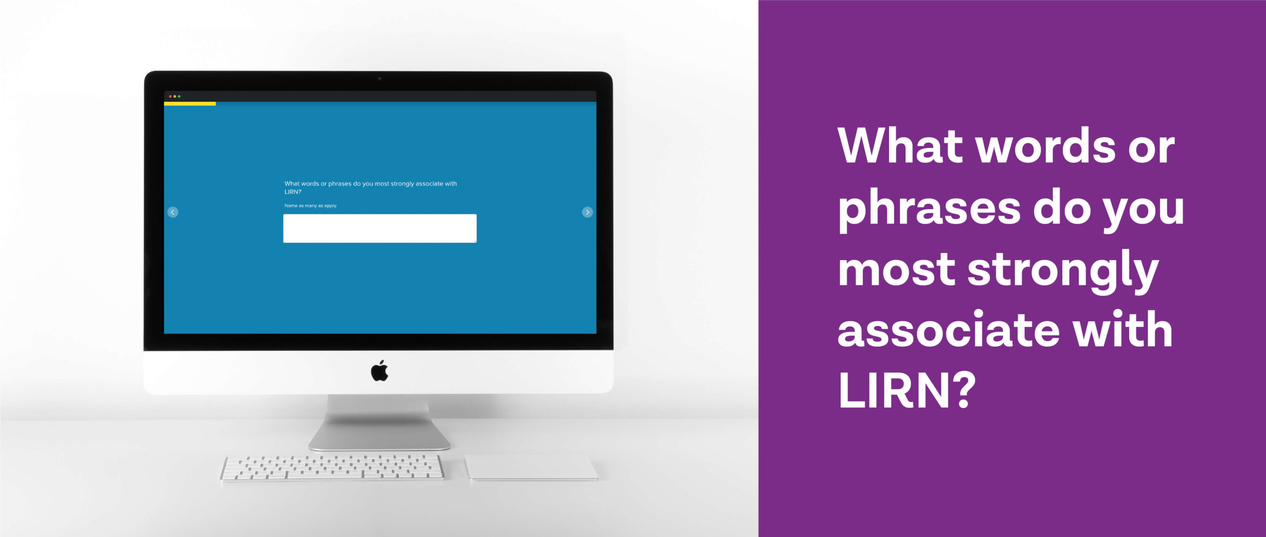
Stakeholder interviews and a team-wide brand survey gave us insight into the organization’s evolution, allowing us to better understand what was working (and not working) about the existing brand. We also surveyed and spoke with a number of customers, librarians, and key external decision-makers to get the community’s perspective.
Through our research we heard stories from LIRN’s members about libraries being saved, lives being improved, careers being propelled—all thanks to the care and commitment of LIRN’s uniquely experienced staff. This, we knew, was the heart of the LIRN story its brand should convey.
Story and Messaging
More than just a collection of resources
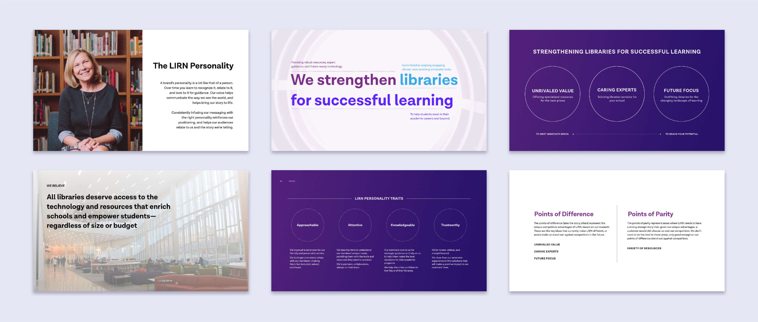
A key insight led our brand story development: For members, LIRN is much more than just a library service and content provider. Membership helps schools keep the lights on—giving private institutions access to the accreditation credentials and resources they need to operate and help their students succeed.
LIRN’s dedicated team of librarians and commitment to serving as an extension of their members’ teams was unique among its competition. At the center of it all was an earnest drive to provide students with access to the tools they need to do their best work and grow their skills for life after college.
This spirit inspired LIRN’s big brand message:
Strengthening libraries for successful learning.
This central promise was supported by a set of foundational pillars rooted in LIRN’s key differentiators for their target audiences: Unrivaled value; Caring experts; Future focus. These pillars and the detailed messaging they gave rise to were cohesively documented within a new set of brand guidelines—equipping every LIRN team member with the ability to bring their new brand story to life.
Visual Identity
Discovering the path forward
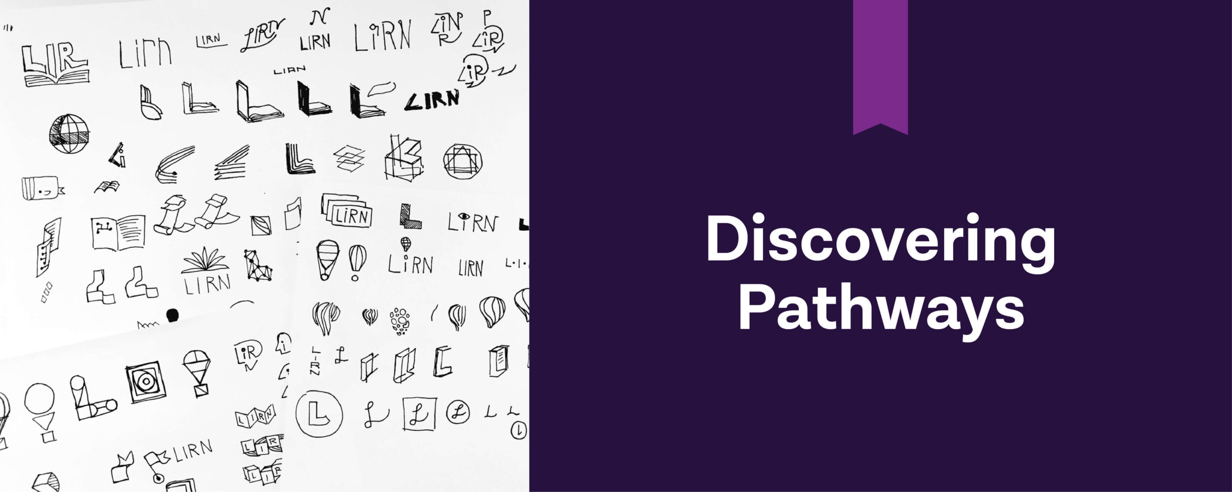
Developing the new LIRN logo was an exercise in discovery and we decided to focus on their name. We endeavored to help LIRN build recognition and meaning into their name, evolving a simple acronym into an ownable, unique word.
We explored a wide range of visual studies expressing how LIRN empowers schools, students, and libraries—providing access to new horizons and thriving networks.
A central recurring concept, Discovering Pathways, became the Visual Organizing Principle—the jumping-off point for creating the new logo and visual system.
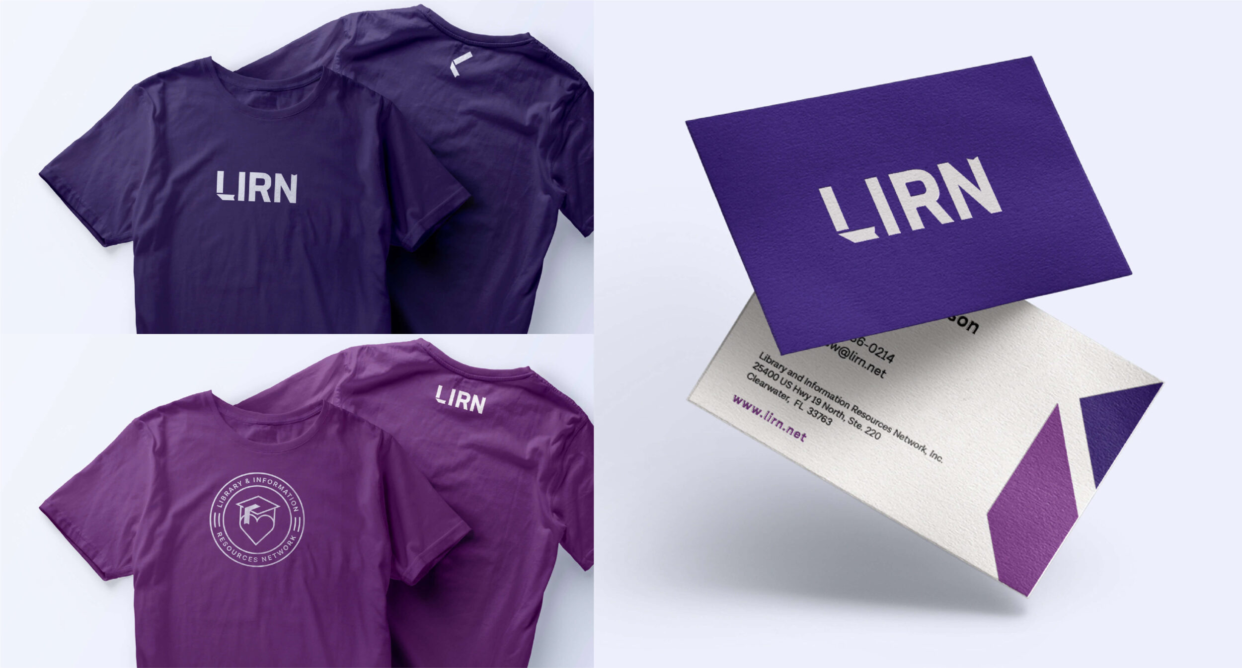
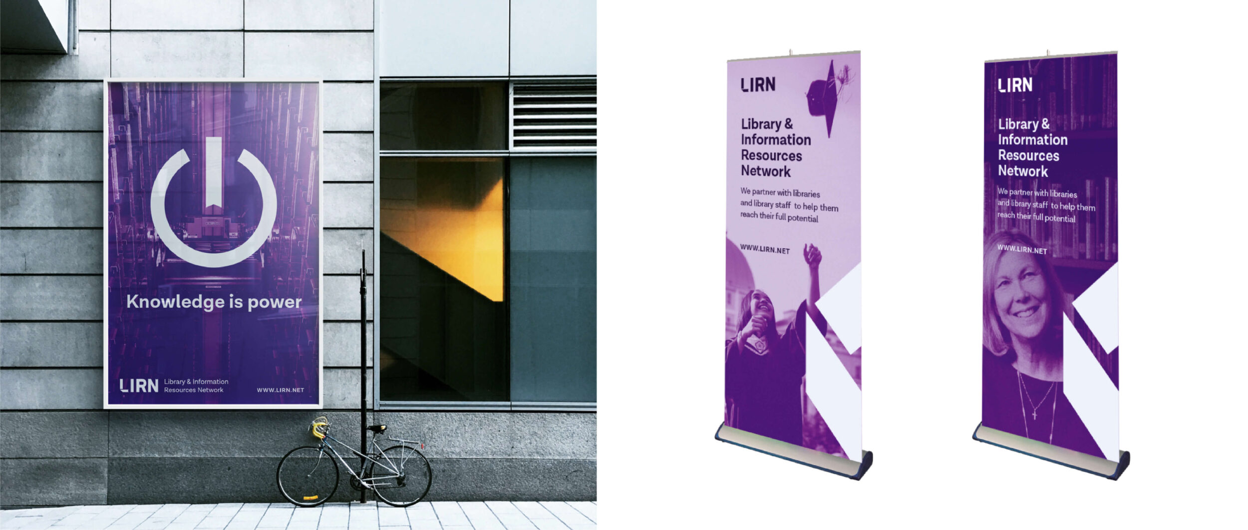
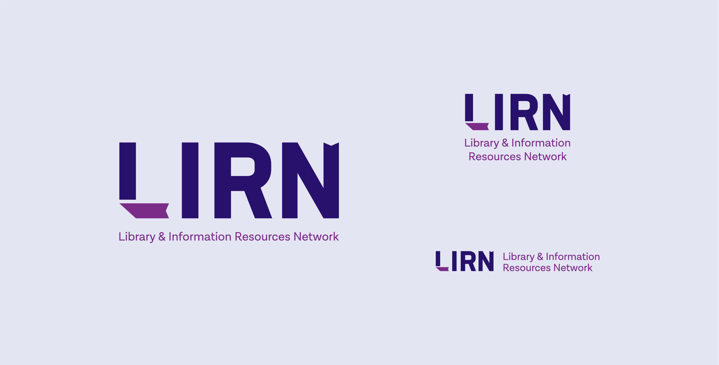
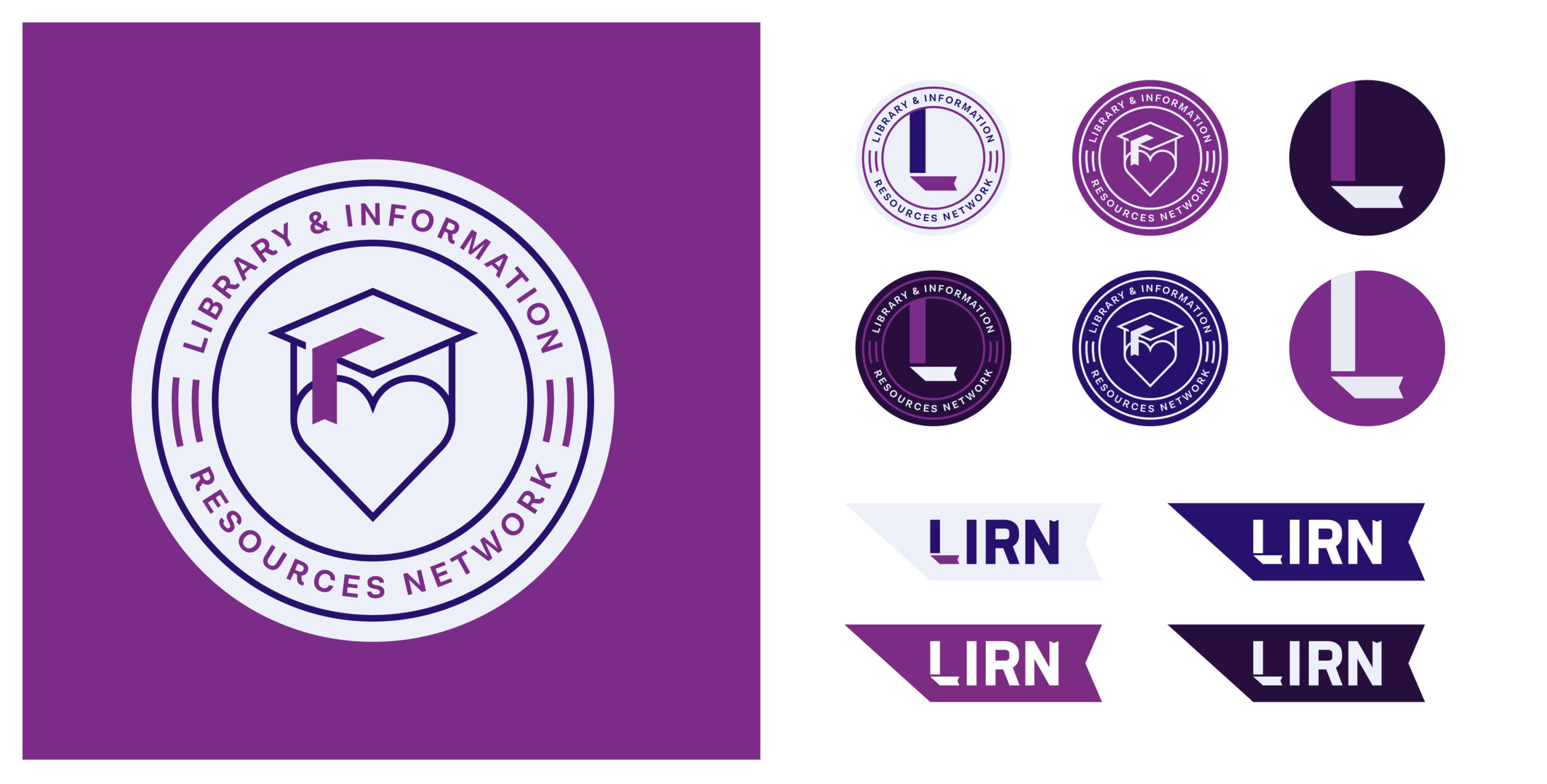
The new logo embodies this pathway—representing a fresh perspective and a clear trajectory for the future. The folding L shape represents the path to higher learning, always something new to discover along the way. A new icon library and photography guidelines unify the visual voice and direction. Bold and clean, the new identity positions LIRN to grow into the future and communicate to their audiences with a clearer voice than ever.
“Bringing our story to life visually brought a whole new dimension to the project, with every element having a meaning that strengthened and enriched the message.”
-Andrew Anderson, President and CEO




Outcomes
Creating vibrant, future-focused centers for learning
Since completing our work with the team, LIRN has revamped their website and fully rolled out their new brand. With their fresh and unified narrative and visual system, LIRN is equipped to not only stand out from a crowded field of competitors, but also share a clear and inspiring story with the world.
LIRN attends library resourcing and accreditation conferences all over the country each year. Their powerful and simple new brand helps bolster interest and engage large numbers of future members at these events—further growing brand awareness and market share.
In the ever-evolving world of education, LIRN’s passion for helping educators and librarians create incredible library experiences has never wavered. Empowering schools, students, and libraries to reach their full potential. And inspiring innovation in education for generations to come.
