Unifying through a new visual identity
New Kind helps Clark Nexsen align around a symbol for a bold future.
Background
Clark Nexsen is a full-service architecture and engineering firm. Nearly 500 passionate experts work at 10 locations in the U.S, including Virginia, North Carolina, Georgia, Washington, D.C., and Texas. The firm offers a wide range of expertise and a multidisciplinary approach to create inspired design solutions for its clients.
Over the past ten years Clark Nexsen has grown and achieved great success. In 2015 the tech firm was named, for the third consecutive year, to Architect Magazine’s 2014 ARCHITECT 50 as one of the top 50 design firms in the US. But such expansive growth has also brought new challenges.
To celebrate its 95th anniversary, Clark Nexsen wanted to realign the company around a new vision for the future. So they partnered with New Kind to design a brand identity system that reflects who the company is today, and where they’re going together.
Industries: Architecture
Services: Identity System
Seeing possibilities
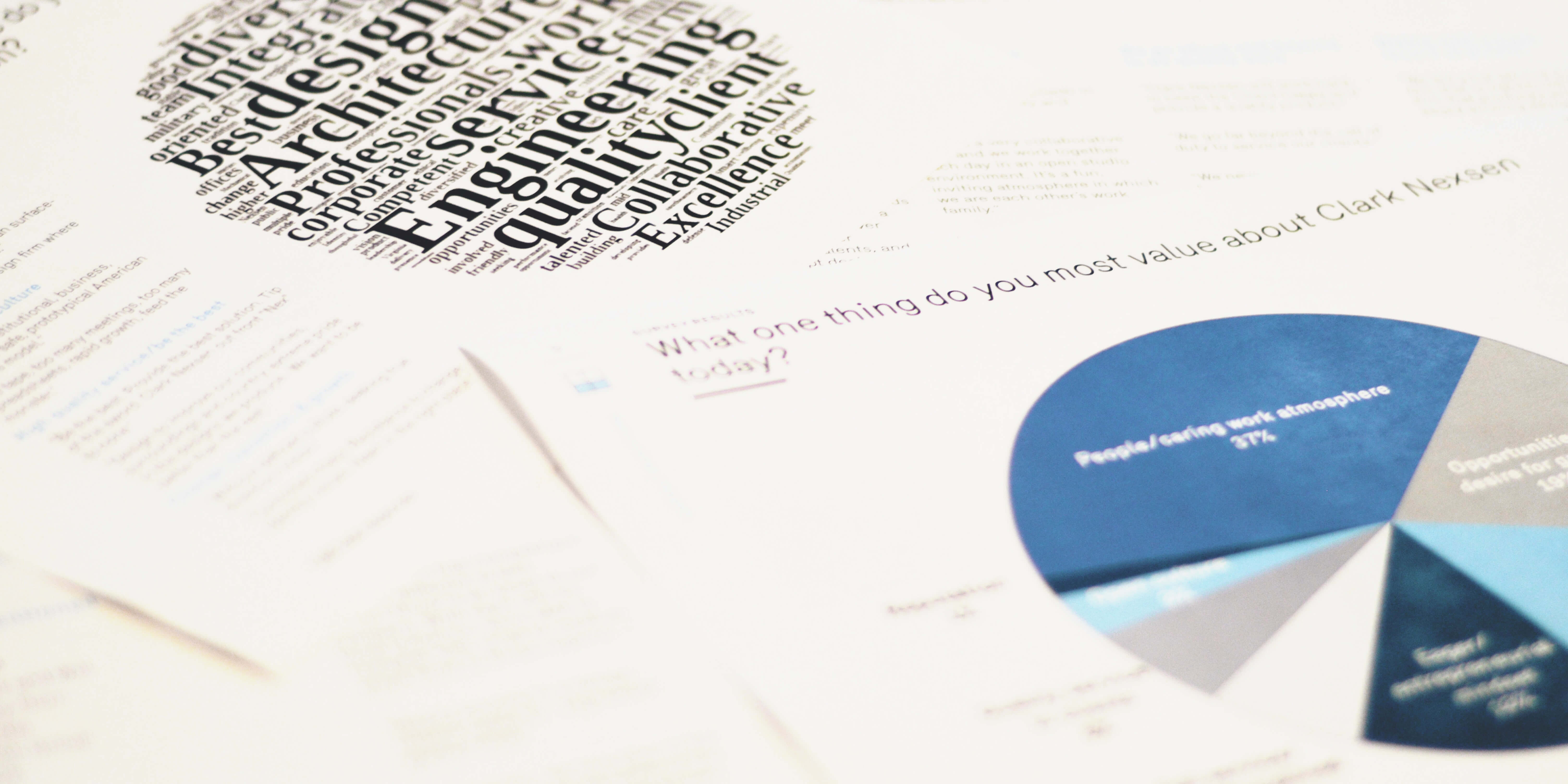
Conducting research
Our first step was to listen. Our goal was to understand internal perspectives about who Clark Nexsen is today, and where the company is headed in the future.
We started by conducting a broad-scale internal survey. We also hosted town hall meetings and interviews in multiple offices. Then we synthesized the data, and shared the results with Clark Nexsen teams. With these new insights we worked together to distill the Clark Nexsen purpose into a simple statement that served as the foundation for what we wanted to illustrate with the design.
Bringing the brand to life
Creating a Brand to Rally Behind
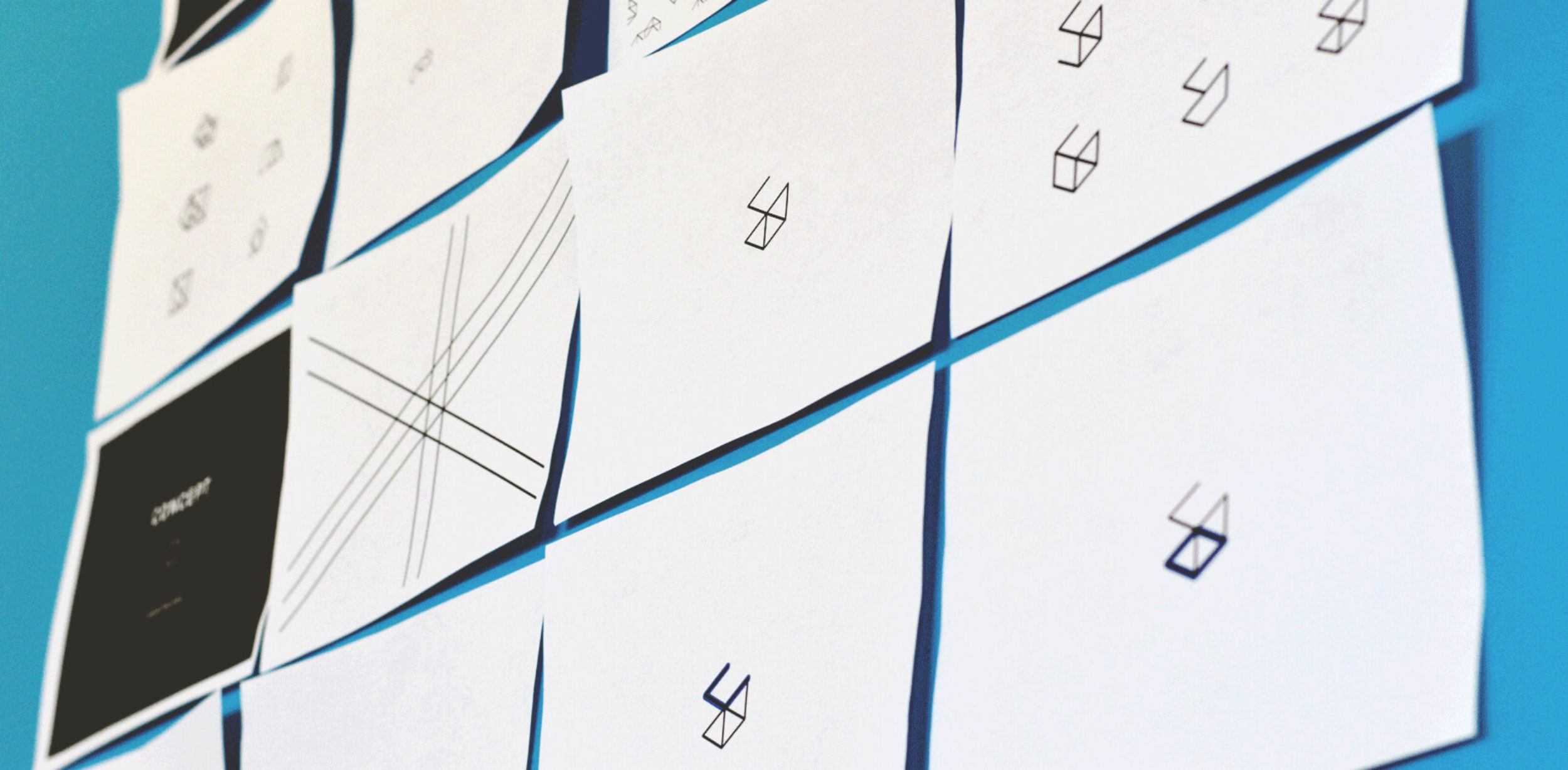
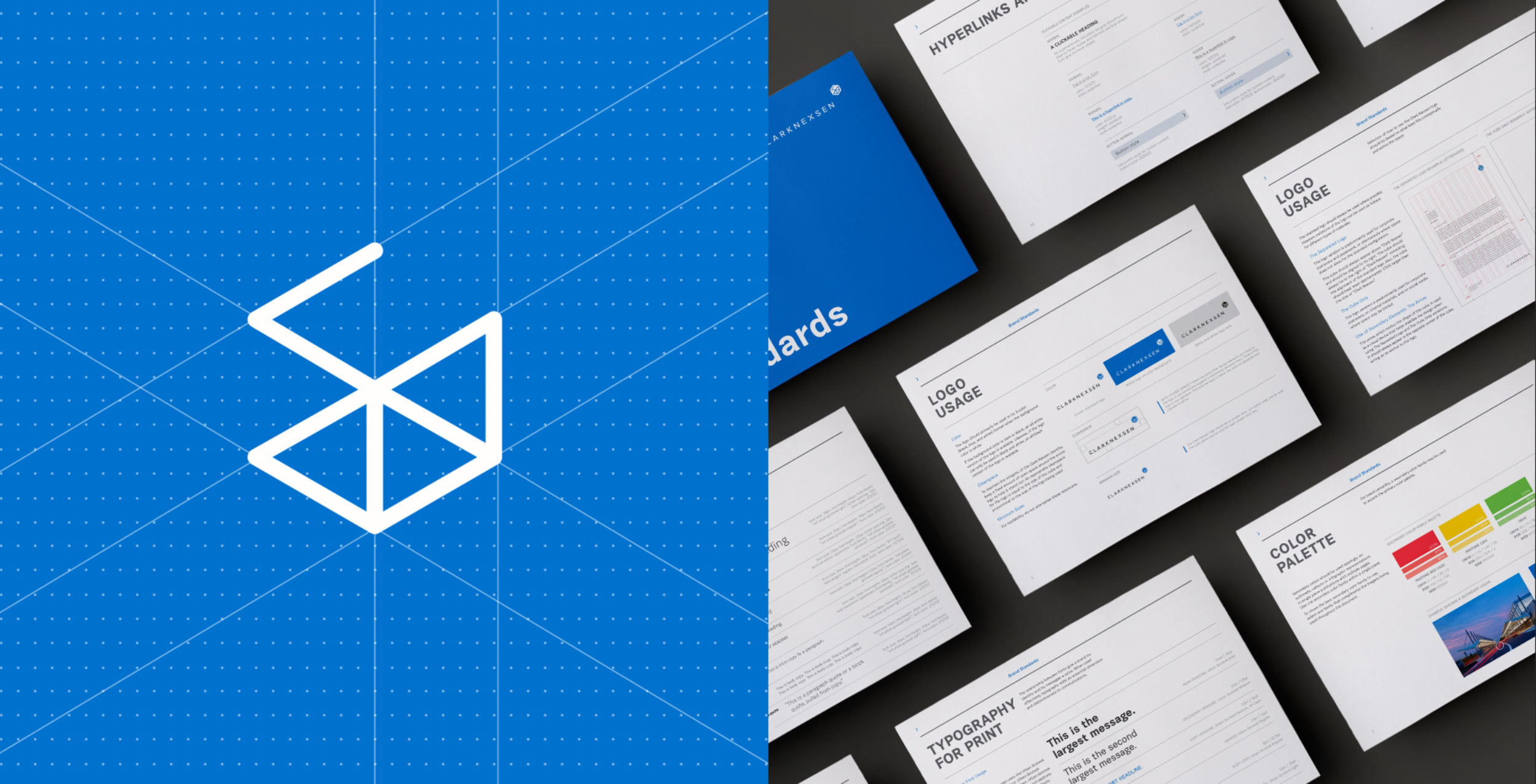
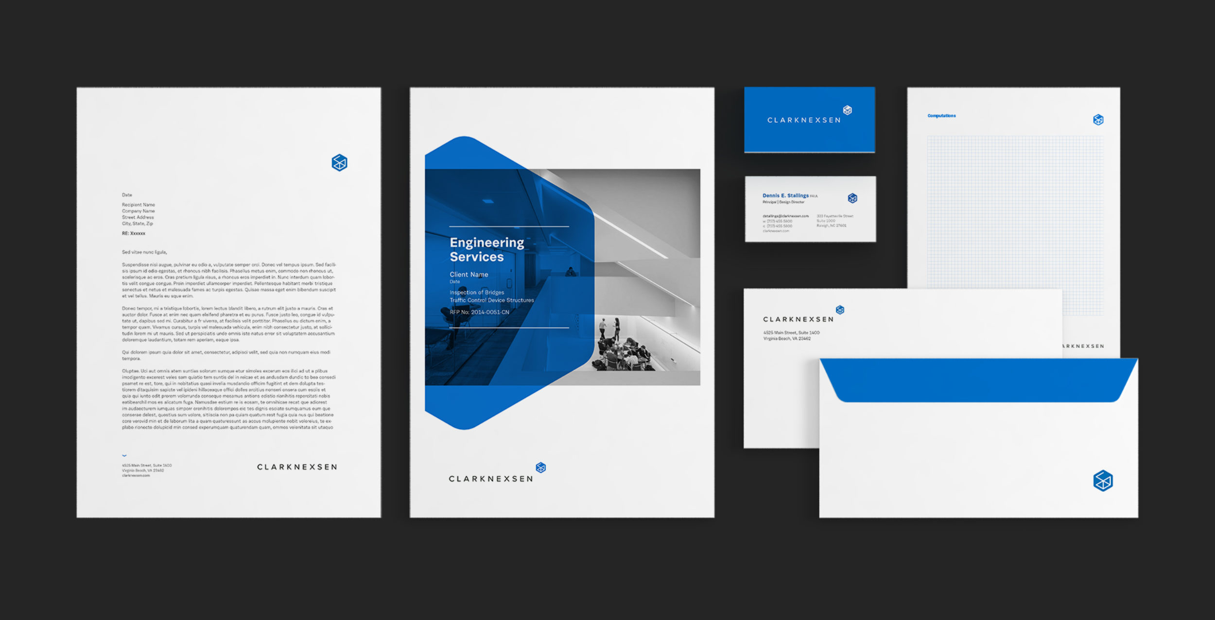
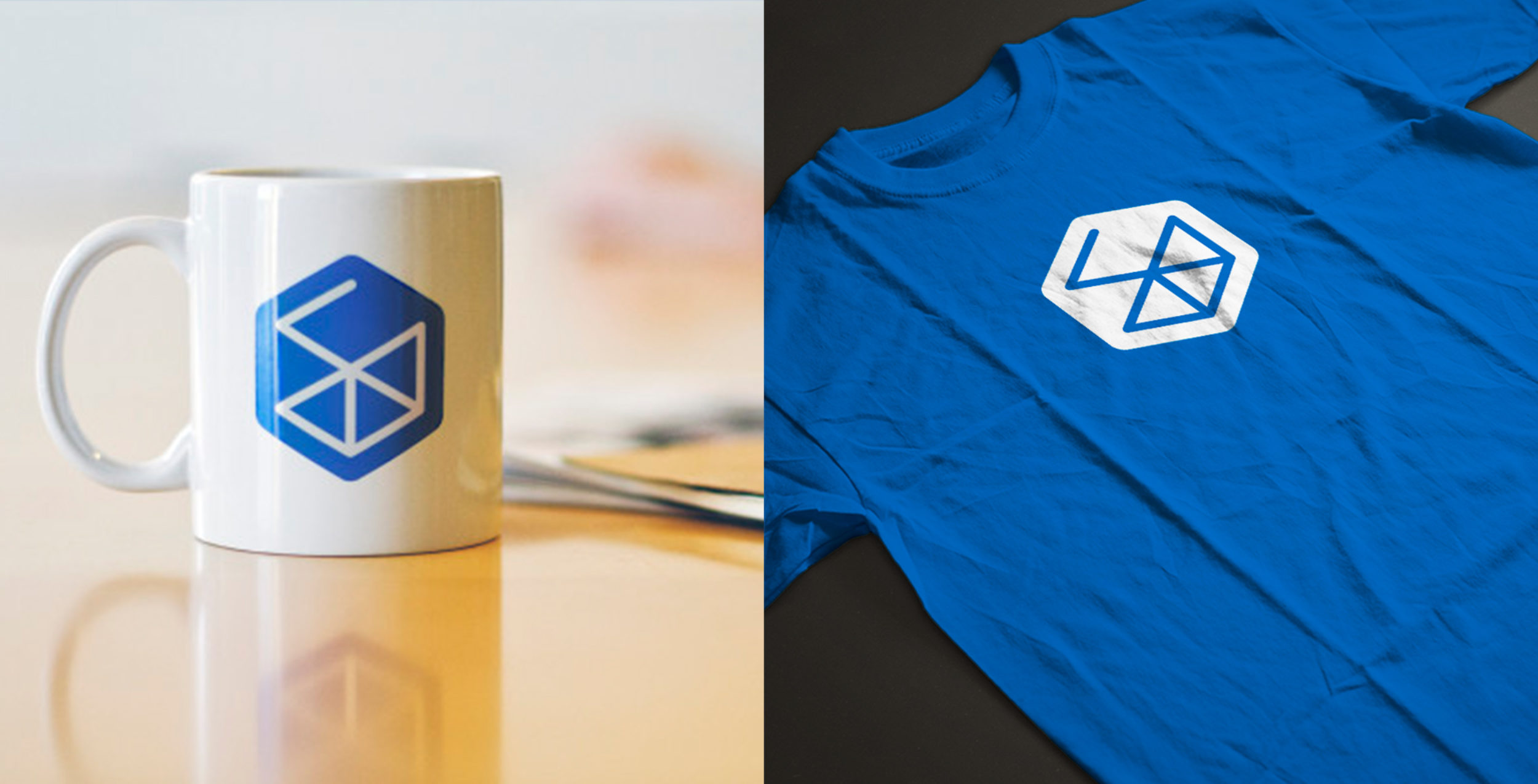
The Clark Nexsen “cube” is the uniting mark to symbolize their unique interdisciplinary approach. With a broad range of expertise across Clark Nexsen, the cube represents their ability to connect ideas—together shaping an outcome that is greater than the sum of its individual parts.
The logo pays homage to the past, while preparing the company for an exciting future.
We developed an identity system and collateral pieces to further support their new mark.

The Brand in Motion
The nature of the “cube”—building inspired solutions together—lent itself well to animation.
We first created a video (below) that illustrates the logo’s meaning and purpose for Clark Nexsen’s clients and partners.
We created a second, internal, video that documented the process of creating the new brand identity, and introduced the new logo throughout the company for the first time.
Why New Kind?
New Kind started by working to deeply understand what makes Clark Nexsen unique. They were then able to distill their research into a memorable blue mark, ‘the cube’, representing the fundamental building blocks and connecting points that are central to all design, engineering and construction projects. New Kind has been an invaluable partner in the effort to bring our new visual brand to life.
Dennis Stallings
Design Director and Principal, Clark Nexsen