Making open source work better—for everyone
Tidelift and New Kind realize a world of possibility—built on better open source software
Background
Open source software is everywhere. Powering the tools and services we all use every day, creating opportunity for developers and professional software teams, spurring innovation.
There’s no doubt that what we’ve been able to achieve with open source software is incredible. But a few open source true-believers saw an opportunity to make things even better—for everyone.
When the founders of what would become Tidelift came to us, they wanted a compelling brand to match their compelling vision. Starting with a name, expressed by an authentic story, and finally brought to life through a vibrant visual identity. The whole kit and kaboodle. All to capture the attention and enthusiasm of customers and open source maintainers alike.
Industries: Technology
Services: Identity System, Naming, Positioning, Research, Storytelling
Why New Kind?
From our first conversations, it was clear New Kind was the perfect partner to help us create the story and identity for what would become Tidelift. From start to finish, their open source expertise, collaborative approach, and strategic creativity were on full display. We love the company we've become, and the future we're working toward—thanks in no small part to our collaboration with the team at New Kind.
Donald Fischer
CEO and Co-Founder
Research
Sharing perspectives on the world of open source
The Tidelift team came to us with a clear vision in mind: to find a way to make open source work better— to find a new way to generate real financial and growth opportunity for the creators, maintainers, and users of professional open source software. Win. Win. Win.
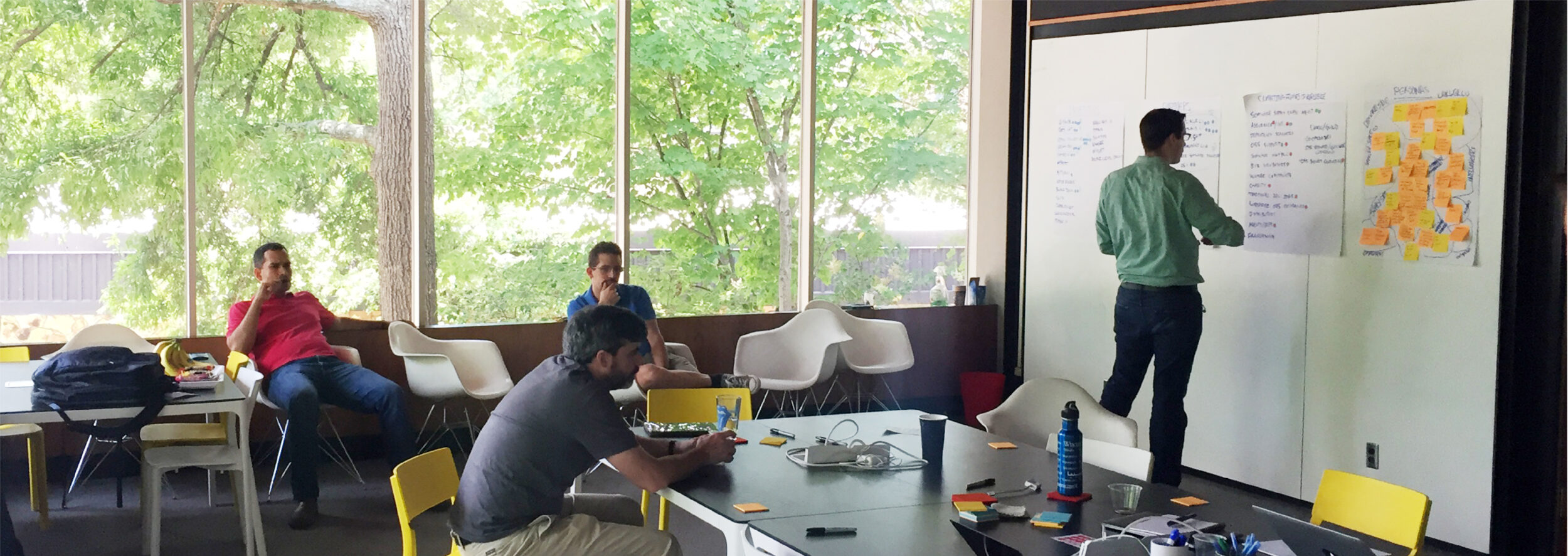
Our first step was a day-long workshop at New Kind, bringing together the company’s leaders to discuss their vision, the competitive landscape of the world of open source software, positioning, and key audience personas.

Naming
Surfacing a name that stands for something
Working alongside the founders, we identified the attributes of the organization that needed to be captured in the new name, and generated and voted on a preliminary list of options.
It was clear that the idea of shared benefit was core to the company and its leaders—so this became the key idea that we knew we wanted our new name to communicate.
Our brainstorm generated a lot of names—some strong contenders, some destined for the cutting room floor. Along the way, each candidate was measured against the criteria we’d defined together. We conducted preliminary checks for trademark viability, weighed pros and cons, and tested each name in various marketing contexts.
In the end, one name stood out from all the others: Tidelift. A big idea nestled within a common phrase: “a rising tide lifts all boats.” A simple, optimistic outlook that vividly expresses feelings of greater good and shared benefit.
Storytelling
A rising tide lifts all boats
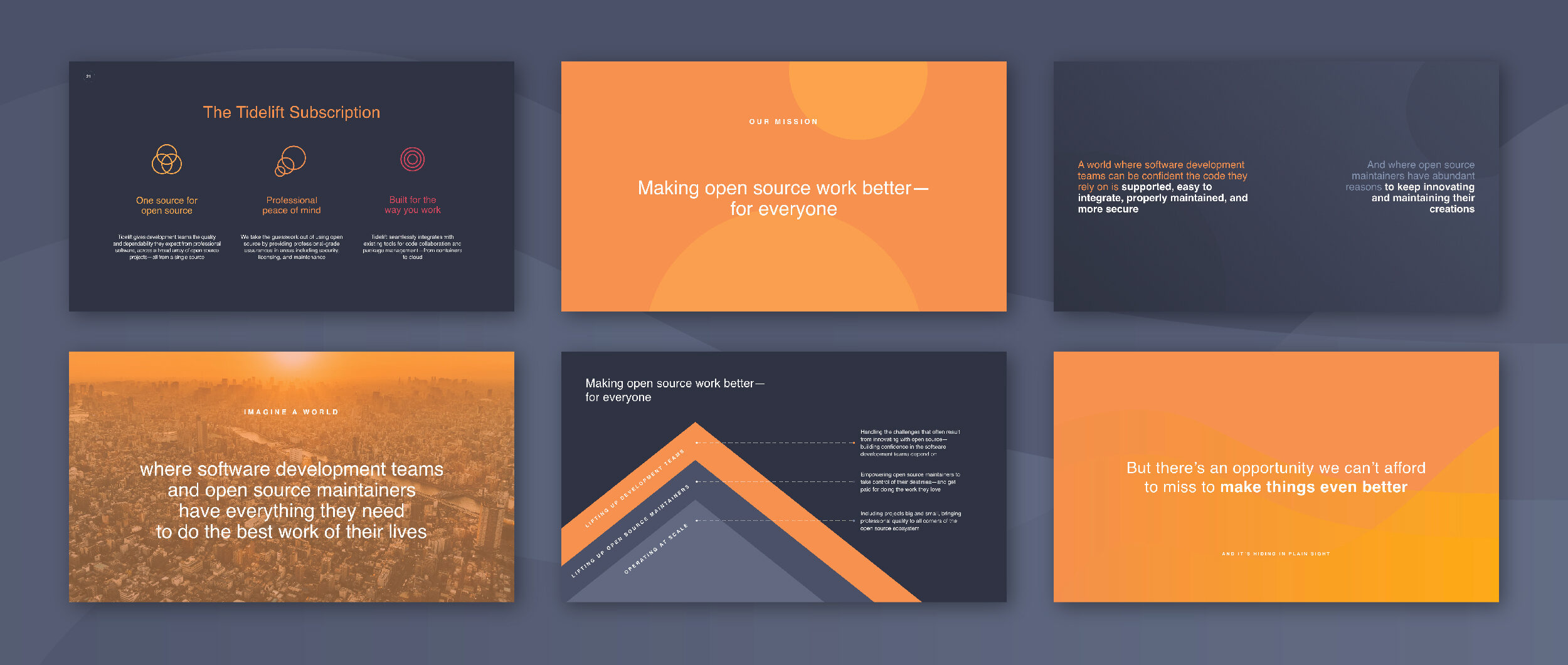
Tidelift was created to help make open source work better—for everyone. To help open source maintainers take control of their destinies and make a living doing work they love. To provide professional development teams with software they can depend on. And to do it all in a way that creates a truly “win-win” open source model—extendable to every corner of the open source ecosystem.
We realized the Tidelift story hinged on this balance—between mutual benefit and business. So we crafted a story that honored both maintainers and professional development teams. To do this, we shined a light on the people at the center of open source—these people, we realized, were the heroes of the Tidelift story.
Most of all, we knew Tidelift’s story and messaging had to be inclusive. We wanted to invite broad participation across the world of open source and beyond. By design, Tidelift’s story is written in words and ideas anyone could understand—no small feat for a tech company. It all came back to seeing a world of possibility—for everyone—built upon better software.
Design
Seeing a bright future for software
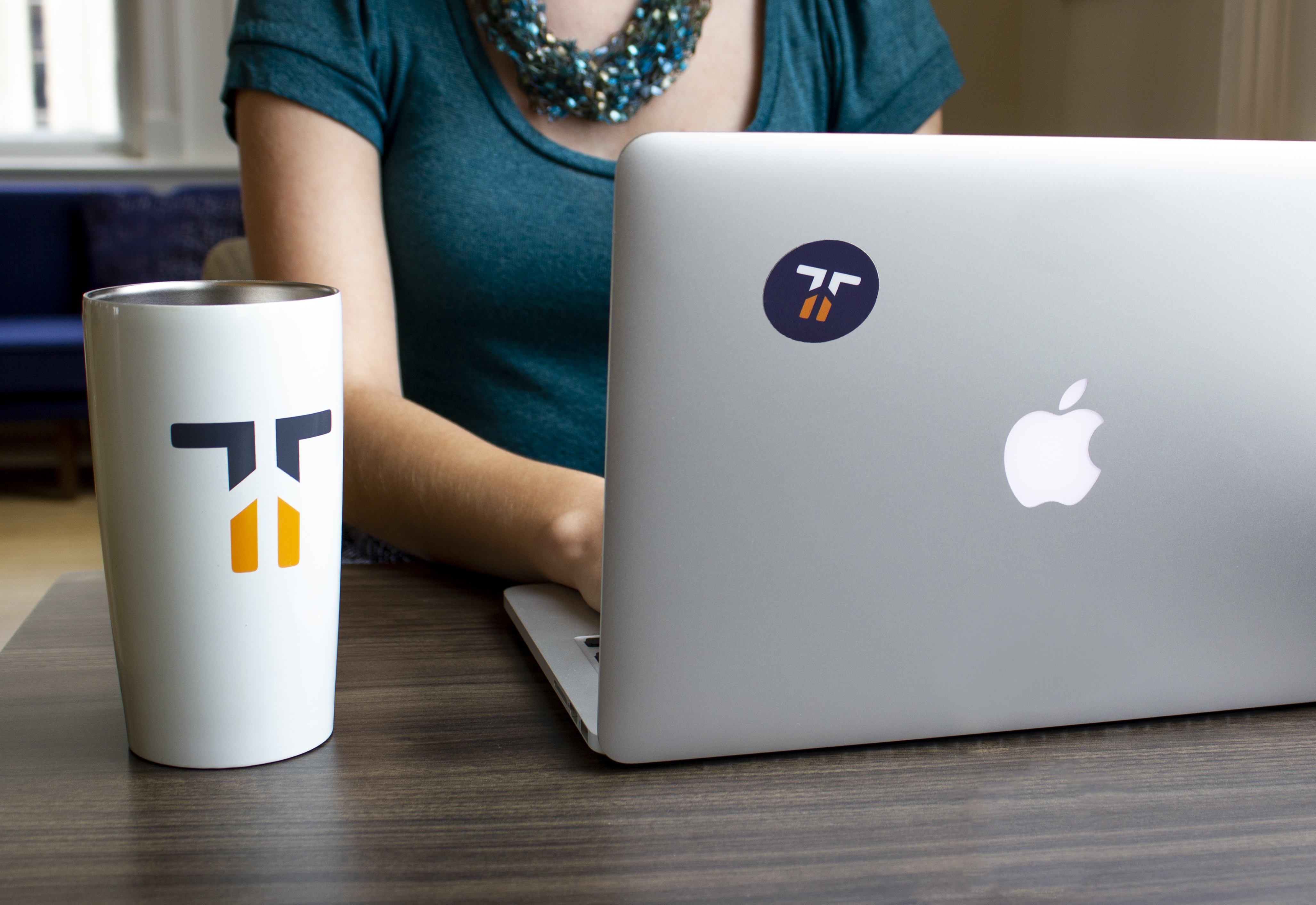
The spirit of Tidelift evokes positivity and a communal feeling of moving together. The mark connects the two T’s in the name—representing developers and maintainers—both lifting upwards in harmony. And the full word mark was created with subtly soft corners to evoke a positive, playful tone.
The Tidelift brand is built on feelings of warmth, authenticity, and shared growth. So we decided to explore warm color palettes that could evoke that same sentiment. We chose a soft orange as the primary color, coupled with a more muted purple that denotes the practicality of the brand.
Tidelift’s orange adds a pop of character that’s unique in the software and technology world—shedding light on the new future Tidelift is working to create.

Outcomes
Bringing the brand to life
Tidelift has raised $15MM in Series A funding from General Catalyst, Foundry Group, and Former Red Hat CEO Matthew Szulik. With the help of a cohesive, story-driven brand, Tidelift is growing—and the tech world is taking notice: a recent Wired article even went as far as to proclaim Tidelift the “Netflix for open source.”
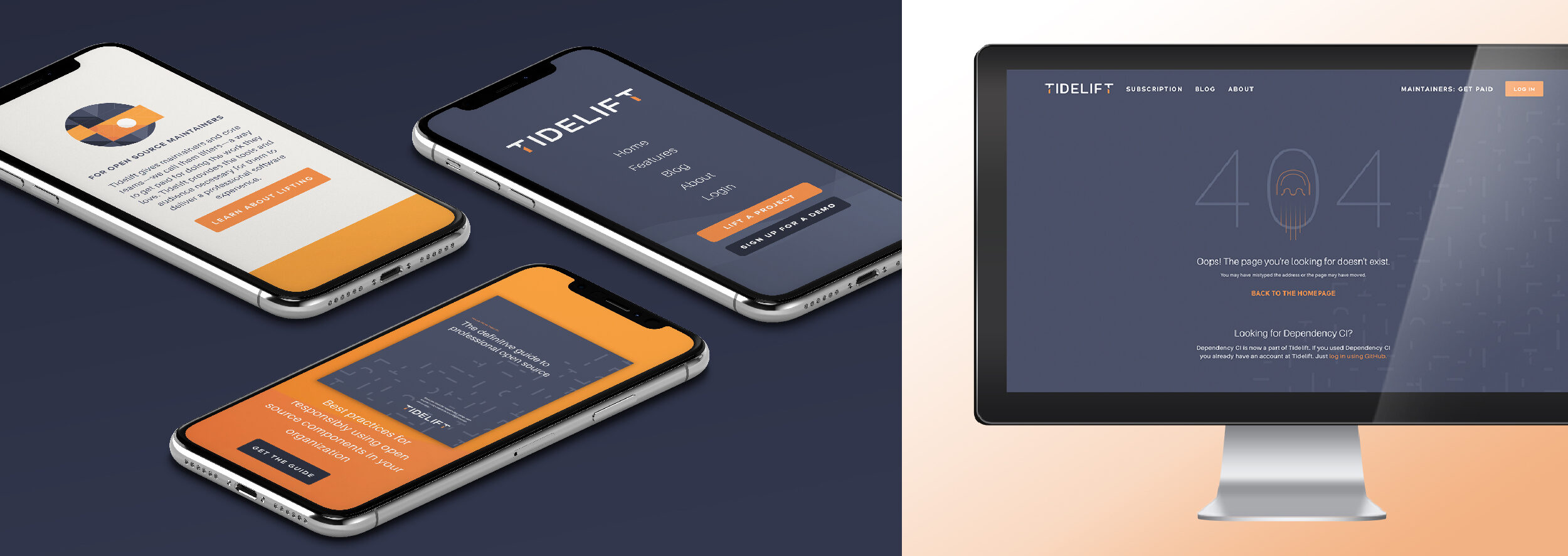
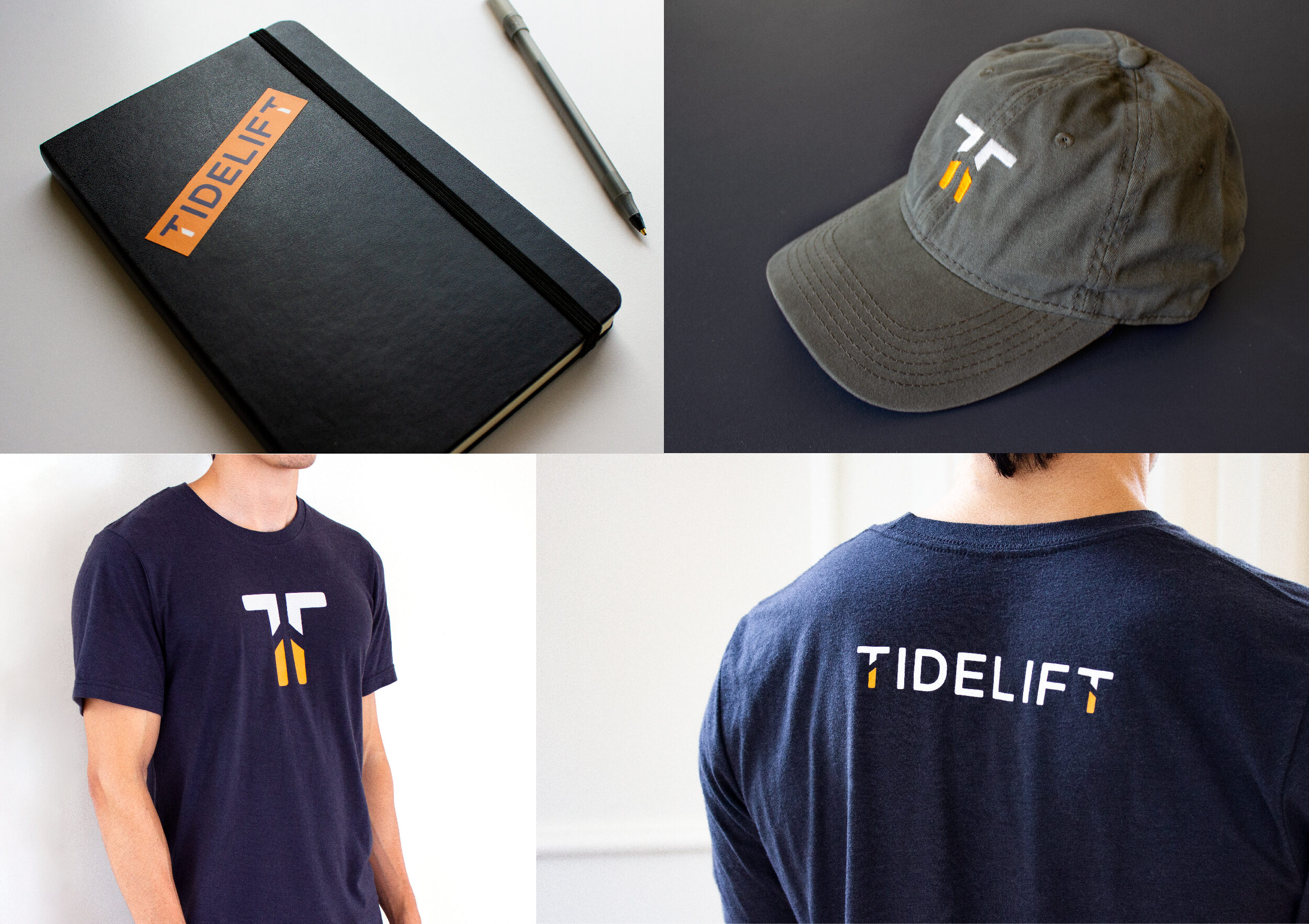
In the time since our work together, Tidelift’s new visual brand has made its debut on a new website, printed materials, conference booths, t-shirts, backpacks, hats, and lots of other swag.
In September 2018, Tidelift announced that they surpassed over $1MM in committed payments to maintainers via the Tidelift platform. The Tidelift story has inspired people to rethink how they use and support professional open source—we can’t wait to see what they do next.
